Banner ads are everywhere. So much that most of us have “banner blindness.” Yep. That’s a thing. We have become so used to them, that blocking them out (or anything that sort of looks like them) has become a subconscious behavior. So when the average user is over saturated with all things advertising, how do you stand out? We have a couple tips to help.
1. Keep it Simple.
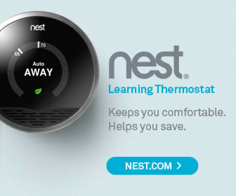
Your banner ad should stand up to the 2 second glance. This means keeping wording down to a minimum, and using imagery that compliments the message. Keep away from busy designs, or flashy annoying animations. Below are a couple of examples of ads that do well to show their message in a clear and efficient manner. The first one being Microsoft, which in recent years has really cleaned up their design act.

Clean. Simple. And to the point.

2. Include your logo.
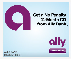
On every frame. Somewhere. Anywhere. Top, middle, bottom. Make sure your brand is there to represent. Ally uses both their abbreviated logo mark and their full name logo.

3. Focus.
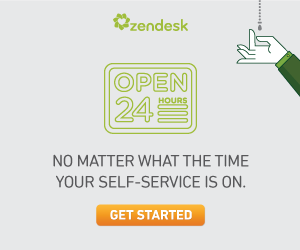
This goes along with the “Keep-it-Simple” rule. Keep your ads focused on your target audience. If you’re advertising a specific service or product, stick to that message. Multiple messages can cause unnecessary business, and confusion. Radio Shack is working this idea by promoting the “gift for dads” angle. Zen Desk is appealing to their late night users, who need support. (probably set to display only at night!).

4. Effective Call to Action.
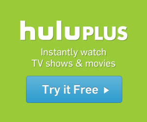
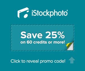
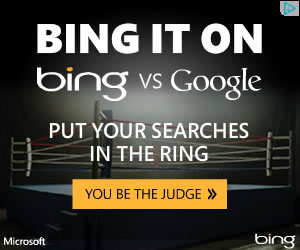
Your banner should have something that is obviously clickable. Buttons tend to convey this better than text. And brighter, bigger buttons tend to have the highest click throughs. Call to actions have their own best practices, which you can review in my previous blog post, but here are a couple examples of some effective call to actions in banners. The hulu banner gives all the visual focus to the button, and brings it home with a nice “Try it Free.” iStock is keeping it interesting here, by using a coupon as the call to action, and has a nice animated arrow reminding you, where it is. Bing is using a classic orange call to action. Orange conveys a sense of urgency that warm colors do well, without the negative “danger” emotions that a color like red can bring out.
5. Make it Interactive.
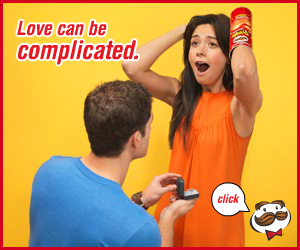
“Interactivity increases brand recall 63% more than non interactive ads”* When dealing with the over saturation problem, interactivity can be one of the most effective ways to gain and keep a users attention. However, a word of caution to avoid creating overly flashy and annoying ads. Below are a couple of select interactive ads. Click on them to see their full interaction.


Sources :
http://bannerblindness.org/
http://www.bannerblog.com.au
* http://adage.com/article/special-report-digital-conference-2010/world-s-banner-ads-worked/143311/
http://www.smileycat.com/design_elements/banner_ads/index.php?page=1
Updated: January 2019